Midway through 2017, Reddit CEO Steve Huffman announced that the self-proclaimed front page of the internet had raised over $200 million . Valuing Reddit at $1.8 billion , the round of fundraising was intended to update Reddit’s video capabilities. But most of it was to give the internet’s number one discussion hub its first design update in over a decade . $200 million sounds like a lot of money for a design update, but the update requires the complete rewriting of the code for the whole site , and a lot of that code was built up over ten years. So why is Reddit pushing ahead with such a drastic overhaul and what will it mean for you?
-Steve Huffman, Reddit CEO

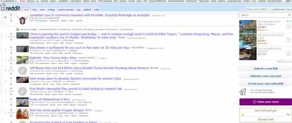
Reddit has always been a pretty basic website that resembles a dystopian Craigslist . It offers anybody the chance to start a community (subreddit) of their own and host conversations around the issues affecting the community. This means Reddit is like a hub for forums on all sorts of topics from niche macabre subjects to the most popular pop culture. As such, Reddit doesn’t need to look visually appealing. In fact, quite the opposite, Reddit’s exclusivity and initial appeal had a lot to do with the fact that it was difficult to use. If you could figure out how to be a part of the conversation, you were welcome to join it.
In this format, Reddit has grown to over 300 million users. It has become the place to talk about everything from Game of Thrones to Space X launching a car into orbit.But by 2018 standards, according to Reddit’s current CEO and co-founder, Reddit is starting to feel old.
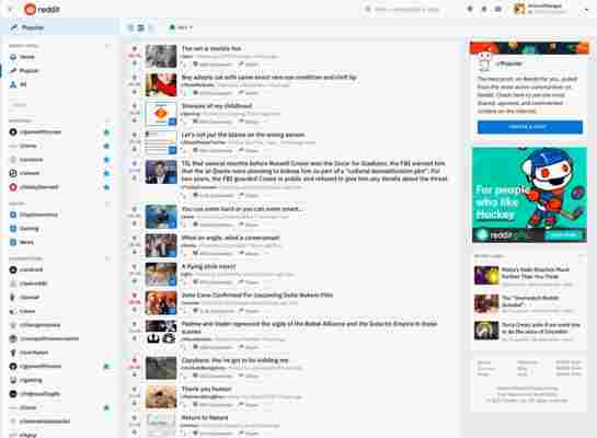
Reddit’s new homepage

-Steve Huffman, Reddit CEO
The most significant change is the navigation menu down the left-hand side , which replaces the navigation menu across the top. This gives users the ability to display links to feeds, subreddits they’re following, and user profiles . This, combined with bigger and clearer fonts, external links that are more easily distinguished from regular text, and a big blue Create a Post button will make it much easier for new users to find what they’re looking for and get involved in the conversation.
Reddit: The Official App Download Now 8

The main problem for the team behind Reddit’s new design is that they have to make it much more accessible for new users without upsetting their veteran base. To do this, they’ve come up with three distinct design schemes that users will be able to quickly switch between using the banner at the top of the page.
3 new ways to view Reddit
Card Design
Reddit’s Card Design represents the most significant break from the Reddit layout of the last decade. Each post gets its own card complete with auto-expanded images and GIFS , which means the subreddit homepage resembles a social media feed similar to something you’d see on traditional social networks like Facebook or Twitter.
Classic View
As the name suggests, Classic View resembles Reddit’s current design scheme the most with subtle changes to button placement and layout offering a more modern look and easier access to the subreddit’s content.
Compact View
Reddit’s Compact View keeps things really simple , offering only the most basic information on each post, like the title and who posted it. If there is media included in the post, there’ll be visible link button that can be clicked to open it up.
When will you be able to access the new design?
Reddit has begun introducing a small percentage of users to the new design. The users are being selected at random so Reddit doesn’t overload their servers, but the plan is to introduce all users to the original design scheme in the coming weeks .
Power and choice
With this significant overhaul, Reddit wants to open itself up and make it easier to welcome new users. A huge focus of this is not just promoting established subreddits but also on starting new subreddits that look distinct from each other. Until now, community mods have had to use third-party apps to do so and in some cases, even resorted to coding to make their community stand out. The redesign now gives users who want to create or manage communities a comprehensive toolkit for a much more intuitive experience. More subreddits should “pop” as a result.
Secure Messaging Apps Telegram Line Signal Confide
Secure Messaging Apps
Telegram
Line
Signal
Confide
All this sounds great if you’ve just stumbled onto Reddit because you were looking for theories about Jon Snow’s true parentage, but what if you’ve been using Reddit for years and you like things just the way they way are? You can resort to Classic View, but if that isn’t enough, Reddit has you covered. You can still use the current decade-old design scheme by visiting old.reddit.com . Reddit has said that it currently has no plans to get rid of the old design entirely.
Do you have access to Reddit’s new design scheme or do you have thoughts about the changes? We’d love to know what you think in the comments below.
