In the beginning, browsers were simple , collecting the few thousand pages available on the internet, indexing them, and letting users interact, whether via AOL dial-up or Netscape Navigator, the go-to browser in the early days of the commercial web.
In the past 20 years, the web has evolved, grown exponentially, and become a much more complex behemoth . The introduction of mobile devices, first smartphones then tablets, created new layers of demand. As mobile browsing has overtaken its desktop antecedent, browsers have needed to evolve even further, keeping pace with growing demand and expectations of consumers and businesses alike.

Let’s take a closer look at how web browsers have evolved to become what they are today.
Many sources claim that the very first mobile web browser was the NetHopper, created for the Apple Newton . Shortly thereafter, Wireless Application Protocol (WAP) was established, creating specifications to standardize development for wireless communication via cellphones and radio transceivers. These protocols allowed for rapid development of apps for email, web browsing, and instant messaging, among others.
WAP browsers at first were called micro-browsers , which could render HTML pages, though the results were poor, in most cases simply shrinking a standard page built for desktop computers.

Microsoft launched the Pocket Internet Explorer, which improved rendering by providing support for cookies, re-sizing of images, and JavaScript in addition to HTML. I n 2005, the Opera Mini debuted , making significant leaps in Java-enabled smartphones. Today, it is still the most popular browser on mobile devices worldwide. Opera renders pages nearly like a desktop browser does and compresses content, speeding up loading and reducing data traffic and expense.
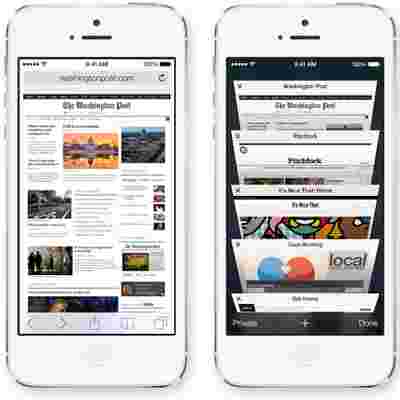
Surfing on mobile remained static until the remarkable advances of touch-enabled devices, first by the iPhone and later by Android smartphones. The Apple browser Safari introduced features that had been unseen previously, including pinch zooming and smooth page scrolling.

Not to be forgotten in this history lesson is the Palm operating system. In the early days of wireless devices, Palm was the indisputable market leader. Its mobile system included a highly functional WebKit browser that performed admirably, but has been eclipsed in functionality by other players.
Innovation has continued in the mobile space, with web designers now retrofitting and building with responsive design in mind. Responsive design creates websites that are congruent on desktops, laptops, and mobile devices, large or small. With responsive design, static web pages are largely a thing of the past.
In less than 20 years, mobile browser apps have become commonplace tools, used by young and old alike. Combining speed and intuitive functionality, today’s web browser apps allow for nearly seamless web experiences , syncing of bookmarks and other features across logins, devices and platforms.
Want to make sure your memories aren’t lost? Take a look at: Best Cloud Photo Storage: 5 Apps to Safely Back Up Your Photos .
